Enough equations! For those tired of linear regressions and tabular data dumps, here are some simple images of the information I gathered during the three longest races that I've run — the 26.2 miles of the 2002 Marine Corps Marathon and the 2002 & 2003 Montgomery County Marathon in the Parks events.
The first and most obvious thing to do is just to plot the time it took me to get to each mile marker:
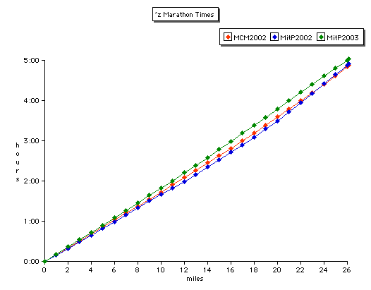
This, however, is less useful than it might be. Sure, I was behind at every point during the MitP 2003 (green points), and faster in the midrange of the MitP 2002 (blue) than in the MCM 2002 (red). But the curves lie too close together to get a good look at the details.
So try remapping the data, to reduce the common trend and reveal the significant differences. Subtract out the time an ideal runner would have taken to get to any given point moving at a perfect 5-hour pace. The result is much cleaner:
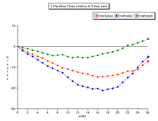
The curves remain in the same relative positions, and it's obvious that the MitP 2003 was slower but much more level-paced. (Perhaps if the race had been a few miles longer the blue and red curves would have crossed the green one?!) The worst collapse was definitely in the final six miles of the MitP 2002.
Now move beyond time and consider speed — the slope of the curves. That graph jumps around a lot (taking a derivative amplifies noise) but is nonetheless quite enlightening in several ways:
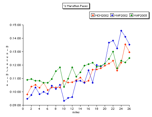
There's that fast downhill mile 10 in both MitP events ... the potty-break spikes in MitP 2003 at miles 12, 17, and 22 ... the dramatic slow-downs in the late stages in all the races ... and the obviously better pacing overall in the MitP 2003, which beat the prior year's MitP in every mile after 20, and which even defeated the MCM 2002 pace for the final two miles. (And I didn't graph the speed for the ultimate 0.2 mile blitz— it's probably off the chart in the case of the MitP 2003.)
More analysis to follow ...
(see also Bless the Leathernecks (28 Oct 2002), MarineCorpsOrdnance (1 Nov 2002), Rocky Run (17 Nov 2002), Marathon in the Parks 2003 (11 Nov 2003), ... )
TopicRunning - TopicPersonalHistory - 2003-11-17
Minor quibble: I noticed that the 'speed' chart is cut off at 9:00 min/mile at the bottom. My personal inclination would be to include the zero line; that would make the relative change in pace much more obvious, and the curve would look less jagged. I know that it also makes the graph less compact and/or less detailed, but the impression it gives in its current incarnation is that of the minute per mile time increasing by 2-7 times, when the actual change is far less. - RadRob
(correlates: RadRob, Unknown Knowns, HannesAlfven, ...)