The ZhurnalWiki perhaps needs a better logo ... here are some candidates ... comments, anyone? Or (threat!) shall I upload more images from my collection of 1852 coinage? (see http://www.his.com/~z/1852.html and/or http://www.his.com/~z/gallery1852.html )
By Robin Zimmermann:
OK, too big, and so is the next one, but they can easily be scaled down....


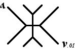


Other ideas? Should there be a "^" (caret) symbol in front of the logo image? a "v" version number after it? (symmetry is nice at times) Color? Shading? Linear or curvy structure? Something Completely Different? (my personal favorites are among the last few)
Pls advise — tnx!
{Hey, none of the images loaded! Is something wrong with my browser? RadRob}
Fixed. – BL
(correlates: DorsalVerityVentralDeceit, FreeRides, CornFloss, ...)